Forums › Forums › Farktography General Chat › This week’s contest › 11-15-06 – Flower Power (Farktography Classic )
- This topic has 31 replies, 12 voices, and was last updated 19 years, 7 months ago by
CaptainJim.
-
AuthorPosts
-
October 14, 2006 at 1:07 am #762
veruca
ParticipantTime for another Farktography Classic theme: Flower Power. Photograph flowers in all their glory!
November 15, 2006 at 4:53 am #6840monkeybort
Participantwhat do you guys think about what i’ve submitted to the pool here for flower power? i’ve been playing around with cross processing effects and i really like the way they came out with the images i like for tomorrow’s contest, but am unsure what the final ruling would be.
all effects/curves/levels/etc. were applied to the entire image evenly.
before:
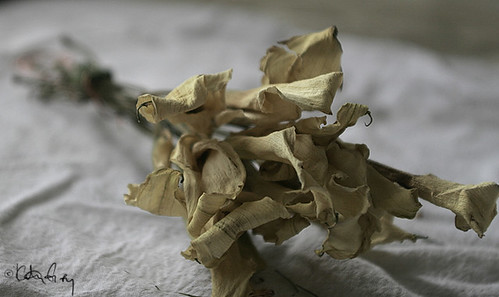
and after:
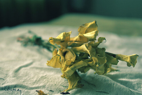
my reasoning is that if i had shot these on slide film, got them processed in c-41 and scanned the negs the results would be the same – so why disallow something that can be done in camera with film? for me it’s on par with converting something to black and white that was shot digitally.
any thoughts? i won’t be heartbroken if the majority is no, just wondering what y’all think. 🙂
i’ve also posted this in the flickr farktog group….sorry for those of you that are seeing it twice!
November 15, 2006 at 5:23 am #6841CaptainJim
ParticipantI don’t mind it at all. However I must point out that the original seems more crisp and there is a lot of wasted negative space around around your main focus. Someone once said that God is in the details, get in there and show us what you see in it. You are a better photog than this shows. There is no excuse for having more than half the frame being wasted when it doesn’t lead the eye any place.
Sorry if I seemed harsh but you can and will do better. 😉
November 15, 2006 at 5:33 am #6842Participantnot harsh, love the critique. this was the first one i did – cropped for the orig. shot and then actually did the cross effect on a different image w/out cropping (i’m assuming the neg. space comment is regarding the processed one?) – sorry for any confusion but they are two different (yet similar other than the crop) images.
November 15, 2006 at 5:35 am #6843millera9
ParticipantI think this is within the rules. Essentially all you’ve done is manipulate the colors (albeit in a more complicated way than normal). When you change an image to Sepia in an editing program, you have to mess with the levels/curves/whatever to get the contrast right. That’s specifically allowed in the rules and this doesn’t seem any different to me. As I said in the Flickr forum though, in this case I like the original much better. On the other hand, the cross processing adds a lot to the one you posted of the red flower. Maybe you should post that one in this thread for CaptainJim 😉
November 15, 2006 at 5:41 am #6844Participantask and ye shall receive – another example of the x-process effect i was going for –
orig:

processed:
 November 15, 2006 at 5:51 am #6845
Elsinore
KeymasterYa know, I’ve wondered this myself since messing with some autolevels stuff that resulted in something that looked cross processed. I think the key is that it’s applied evenly to the image, so I think it should be allowable.
I do like the framing of the first picture better than the second on your top set, but the cross processed color is nice. And it definitely adds some pop to the red flower.
November 15, 2006 at 7:16 am #6846ParticipantThe first pic has backlighting and the second has a pink filter applied evenly. What is better?


And if you wonder why it looks like a painting it’s because of an extreme crop and gaussian blur followed by unsharp mask.
November 15, 2006 at 8:45 am #6847swampa
ParticipantThe first pic has backlighting and the second has a pink filter applied evenly. What is better?
I think your second image looks better, it feels more alive to me.
November 15, 2006 at 1:57 pm #6848Participanti like the first one better – the contrast between the middle part (sorry, i’m not up on the flower lingo :P) and the petals makes it more interesting, IMHO
November 15, 2006 at 3:15 pm #6849KeymasterI prefer the first, but that’s partly because I prefer that darker purple than the ligher pinker purple. I do also like the play of shadow/light better in that one than the second, like what ‘bort’s saying.
November 15, 2006 at 5:52 pm #6850zeke
ParticipantI gotta go with door #1, actually. IMO the pink filter brings out the highlights of most of the flower nicely, but you lose the quality of the dark tones at the center of the flower.
November 15, 2006 at 6:37 pm #6851KeymasterI might not be around much tonight other than posting mine…picked up a stomach bug somewhere..bleh…
November 15, 2006 at 7:25 pm #6852bobroberts
Participantmonkeybort: From your first set, I like the crispness of the first pic and the colors of the second. From the second set I like the colors in the original much more than the yellowish tint I see in the processed photo. (I really like that vibrant red, and the processing seems to dull it a bit.)
CaptainJim: Without hesitation I pick the first photo. The lighter colors make the second photo appear (to me) faded.
Feel better, Elsinore!
November 16, 2006 at 1:06 am #6853Participantlink to tonight’s contest.
hope you feel better soon elsinore!
-
AuthorPosts
- The topic ‘11-15-06 – Flower Power (Farktography Classic )’ is closed to new replies.