Forums › Forums › Get Technical › In the darkroom › Layers, Blend Modes, and the digital darkroom
- This topic has 47 replies, 13 voices, and was last updated 15 years, 7 months ago by
Curious.
-
AuthorPosts
-
November 27, 2010 at 5:51 am #36297
SilverStag
ParticipantPlease don’t take this as a personal attack. I’m just sort of Farktography old-school I guess, and it just seems to run counter to the spirit of the rules (“show us your camera skills/we don’t care much about your computer skills”) even if it’s in line with the current wording.
I don’t take it personally:) I think that we can have these discussions in the spirit of give and take and not get bogged down in derails, and that Farktography will be healthier for it.
Let us, for a minute, assume that Farktography took place in the real world, and every Thursday we had a photo contest in Lexington, KY. People would certainly do their best for that sort of venue. Printing and presentation would play a part in how photos were received, as well.
Now, bring us back to digital world: Experience shows that the voters are a fickle bunch, and are just as easily swayed by a cute kid or Farky goofy photo as great photography. How do you stand out in that bunch?
The playing field is pretty much leveled on presentation: nothing is going to be any wider that 640 pixels, and pretty piss-poor web quality at that because of the file size limits. I don’t think it matters that much what you do to the photos at that point because it’s not going to make it stand out that much more- the playing field is pretty much a billiard-table.
I am sure that every one of us cares about our work, or we wouldn’t be here. I’m simply trying to be a voice for good and even some great photography to find its way into the contest. When I was in photojournalism class way back in 1970 with Mr. Bolander, he told us that great photographers weren’t just good with the camera- they had to have the whole skill set whether they used it all or not- Studio lighting, action shooting, darkroom tricks, retouching prints with a fine sable brush, everything. Maybe I was fortunate that I had such a fine and skilled teacher, but I’ve always believed that if you have the tools, you use them to get the result you want.
November 27, 2010 at 8:41 am #36298ravnostic
ParticipantJust a note to say this is an educational thread. I’m 1/2 lost in it, but am grasping the larger concepts. I should take a photography class. There seems to be much to learn.
November 27, 2010 at 2:14 pm #36299ParticipantJust a note to say this is an educational thread. I’m 1/2 lost in it, but am grasping the larger concepts. I should take a photography class. There seems to be much to learn.
I’ve been doing it for 40 years, and I learn new stuff all the time. It’s a life-long project if you let it be 🙂
I’m glad to see people participating and getting something out of it. rav, why not ask about the things that are unclear? Someone will undoubtedly chime in to help you out 🙂
November 27, 2010 at 2:23 pm #36300ParticipantI’m enjoying the give and take here; I’d like to see more people participate.
FWIW, I think you’re right. The method you use is a digital analog (HA!) of a accepted darkroom process. I would say it is fair to use in Farktography.
In re: the color shift: Cameras are notorious liars to begin with, and a camera as demonstrably imperfect as a digital camera lies even harder. I was trying to recover the remembered color of the dawn hour where the sun was just reaching the mountaintop, and the dark sky beyond provided an extraordinary contrast. The meter in the camera bollixed up the exposure for fair, so it was up to me to try and recreate what I saw and felt.
Of course, I make the same argument about HDR. The best correction of this shot:
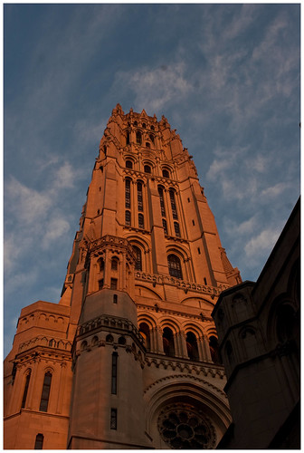
is just to dark, the sky is dropped off and the shadows deeper than they really were, also the color of the stone in the sunrise was shades redder than the captured.
So, using a HDR I am closer to the tonal range of the actual conditions. Looking back at this shot, I should actually cool the temperature of the shot down but with the sun hitting the building just over the horizon, this was as close to the actual scene as I could make it. And I couldn’t do without the software.
Hmm. Could I take a shot at that original? Is it RAW or JPG?
November 27, 2010 at 2:45 pm #36301ennuipoet
ParticipantHmm. Could I take a shot at that original? Is it RAW or JPG?
It’s in raw, here is a link to the original in Canon Raw
http://www.freeversephotography.com/_MG_8790.CR2
You know, however, if you take it and use software to normalize or equate to the HDR shot, that is going to prove Elsinore‘s point? 😀
November 27, 2010 at 4:20 pm #36302ParticipantHmm. Could I take a shot at that original? Is it RAW or JPG?
It’s in raw, here is a link to the original in Canon Raw
http://www.freeversephotography.com/_MG_8790.CR2
You know, however, if you take it and use software to normalize or equate to the HDR shot, that is going to prove Elsinore‘s point? 😀
Hmm, my very first Canon Raw.
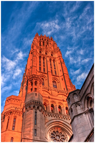
Here’s what I came up with:
The first thing I notice is that it looks much more orange-y and saturated in the browser than it does in Photoshop. Hmm.
What I did:
In Camera Raw, I adjusted the exposure- the original seemed to be underexposed by about 2 stops.
I used the fill light in ACR to lighten the deep shadows a bit. This reduced contrast, but I was going to get that back in CS3.
Opened in CS3-change to LAB mode-smart sharpened the lightness channel- did the LAB mode color boost trick.
Back to RGB mode:
Did a Soft Light layer to add back the contrast lost in ACR (Camera Raw) Adjusted the effect using the opacity slider.
Flattened
Did a multiply layer to intensify the color. Looking at it in the browser, I think I didn’t dial it back enough with the opacity slider.
Flattened, converted to 8 bit, Saved as Jpg.
(Edited) I opened this up in IE9, and Chrome to compare with my default Firefox. Both of those browsers much more closely match Photoshop than Firefox. I wonder if there’s an adjustment for color space in Firefox?
November 27, 2010 at 4:42 pm #36303nobigdeal
ParticipantHere is my version

_MG_8790 by MusicInPictures.net (Ken Cote), on Flickr
Opened in Adobe Camera Raw
Auto fix button (I find this to be a good starting point on many photos)
reduced brightness & exposure from what the auto fix set them at
boosted vibrance & clarity a bit
opened in PS elements 6
open duplicate layer to work from
Run through Topaz DeNoise 5 on Raw Lightest setting
Boost slider for recover detail & reduce blur
Run through Topaz InFocus to sharpen a bit
Isolate sky and boost saturation a bit
merge layers and saveAfter looking at it in the browser I went back and boosted contrast a bit.

_MG_8790-1 by MusicInPictures.net (Ken Cote), on FlickrNovember 27, 2010 at 5:00 pm #36304Curious
Participantcomments for what they are worth. oh and i’m using FF on an uncalibrated straight out of the box LG 23″ LED monitor.
best sky, SilverStag best building, ennuipoet.
but in either case the building is too orange. while i understand that early morning and late afternoon (just after the sun is over or going over the horizon) brings out orange in my film experience it isn’t that pronounced. haven’t shot enough early or late with digital to know/see the effects. and when i was printing film you could really mess with the orange to suit taste. one of my nicest looking landscapes was cliffs at laguna beach, ca but just slight tweaks of the filter pack produced results from great to meh.
so while i was writing this i opened IE8 and then saw NoBigDeal’s version. 1) FF and IE both are pretty orange 2) NoBigDeal’s version of the building looks closer to what my memory says early morning buildings look like.
as far as the shadow goes my best guess in the ennuipoet HDR is closest to what you eye sees but probably not what gets recorded on the media.
in any case YMMV 🙂
November 27, 2010 at 5:04 pm #36305Elsinore
KeymasterHere’s UFRAW and GIMP. I could play with it more, but I’m getting ready to head to more family stuff

ennuipoet_MG_8790-sat-bright15cont5-usm444 by lady_elsinore, on Flickr
In UFRAW, I took the camera white balance and toned it down a bit to color temp 4821 with a green level of 1.009. (The camera’s white balance was 5310). UFRAW’s default curve is linear, which doesn’t work for most photos, so I adjusted that a bit, then adjusted the regular curve to bring up tones a bit overall. Also added exposure compensation, about a third of a stop. In GIMP, I boosted saturation across the image as well as on the blues to improve the sky. Then I increased brightness to 15 and contrast to 5 to bring out a bit more of the shadows. Resized then did unsharp mask (radius 0.4, amount 0.44, threshold 0)November 27, 2010 at 5:39 pm #36306 orionidParticipant
I wish I could participate in this thread. Today was my recovery day after a suicide run to Philly and back, and I’m leaving in an hour for Buffalo and still need to pack.
Just a quick comment, This thread has opened new ideas for me, as I’m guilty of going the destructive route and applying changes to the original layer. I’m a master of CTRL-Z and file>revert.
November 27, 2010 at 5:53 pm #36307ParticipantSure, I’ll bite.

I don’t know all the lingo, so here goes: I used my Canon Digital Photo Professional (whew–that part was easy!). Brightness is at 32, contrast at 12, saturation at 98 and sharpness at 210. I changed the color temp to 64K. Other than that, there’s the RGB channels (?), which I don’t know how to describe, so here’s a pic:

My goal was to 1) reproduce the very much golden/reddish lighting of early sunrise–the shadows tell me the sun’s within ~/<15 degrees of the horizon 2) stay true to the natural colors, in that shadowed areas are lit by reflected sky-blue lighting (which I worked with the curves to bring out), and thus become more 'purple' as a result, and yet [see larger image] detail is still preserved and even a bit enhanced in the darker areas at the fuller resolution.
Can’t say whether or not I achieved any of that, but that was the effort. Should all fall within current f’graphy parameters. No?
Bigguns:
http://fossilspringsaz.com/pics/2010/nov/24/_mg_8790weblg.jpg
November 27, 2010 at 5:54 pm #36308Participantoh, and I didn’t bother with dust delete. And wow, but didn’t that come out posting much more poorly than I’d anticipated?
November 27, 2010 at 6:12 pm #36309olavf
ParticipantHere’s my take:

I use DPP as my RAW editor…
Initially I set the WB to ‘daylight’ but it didn’t quite work after I started tweaking settings, and ended up with a custom WB of 4400K. I used the ‘Landscape’ picture style preset which tends to make the blues pop a bit more, particularly, but it also brings out some of the lowlights. On the RAW tab, contrast +1, shadow +2, sharpness @6. On the RGB tab, dropped the red curve a hair, and bumped the blue by a hair less. Used the stamp tool to get rid of those two dust spots in the sky that were bugging me.Didn’t do nuttin’ in Gimp except resize.
November 27, 2010 at 6:38 pm #36310sleeping
Participant
_MG_8790 by awrose, on Flickr
1) Custom white balance, exposure +0.90, fill light 69, clarity +68, vibrance +47 in Camera raw
2) Smart sharpen 100%/1px
3) Topaz denoise (light)
4) Duplicate layer – Overlay blending mode – High pass filter @ 62.7 px (enhances local contrast). Toned layer opacity down to 29%
5)Slight S curve adjustment layer
6)color balance adjustment layer – increased red, decreased blue and green slightly in shadowsNovember 27, 2010 at 6:40 pm #36311ParticipantI also cropped it slightly and killed a dust speck or two….
-
AuthorPosts

- The topic ‘Layers, Blend Modes, and the digital darkroom’ is closed to new replies.