Forums › Forums › Farktography General Chat › This week’s contest › 09-10-08 – Orange
- This topic has 106 replies, 26 voices, and was last updated 17 years, 9 months ago by
Snug Tight.
-
AuthorPosts
-
September 10, 2008 at 1:36 am #18351
redwoodcruzr
ParticipantWell folks, it seems my Fark-fu has been erratic at best. Since I actually have a number of different possibilities for this weeks theme, I thought I’d offer them up to the Fark masters for a critique. Be brutally honest.
Thx.
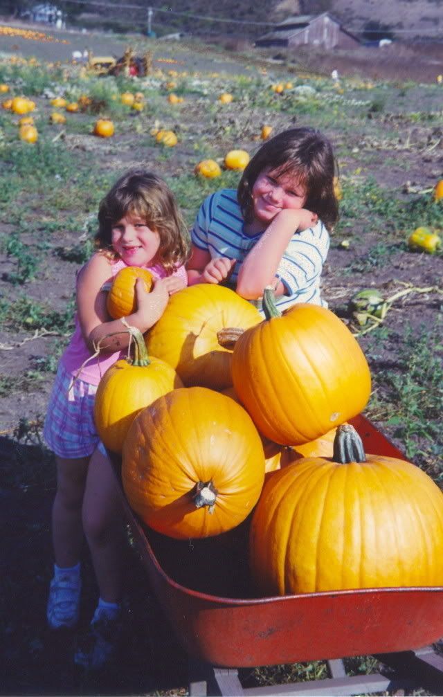
Redhttp://i263.photobucket.com/albums/ii135/jbenigno/Farktography/OrangePipesmall.jpg
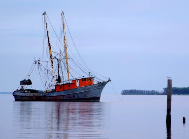
http://i263.photobucket.com/albums/ii135/jbenigno/Farktography/HaulOPunkinssmall.jpg
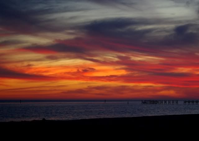
http://i263.photobucket.com/albums/ii135/jbenigno/Farktography/FireintheSkysmall.jpg
http://i263.photobucket.com/albums/ii135/jbenigno/Farktography/TigerSharksmall.jpg
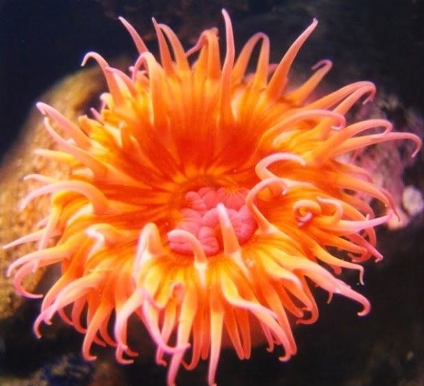
http://i263.photobucket.com/albums/ii135/jbenigno/Farktography/Anemonesmall.jpgI like the pipe (color jumps out at you)& the boat (great mood)for what my opinion is worth.
Thanks for the feedback. I’m torn on the boat pic. I also like the mood it communicates, but I’m just not sure its Farky enough.
September 10, 2008 at 1:42 am #18352Choc-Ful-A
ParticipantWell folks, it seems my Fark-fu has been erratic at best. Since I actually have a number of different possibilities for this weeks theme, I thought I’d offer them up to the Fark masters for a critique. Be brutally honest.
Thx.
RedIf you want votes you probably should ignore my comments, since I have a poor track record picking my own pictures! But having said that, I think the orange in the pipe photo jumps off the screen nicely. My guess is that the kids/pumpkin pic would get votes even though the orange isn’t as dominant as the others you posted. I like the boat in the harbor personally (but I’m biased since my dad is a commercial fisherman) but I think it would have to be cropped to make the orange a bigger percentage of the image to grab voters. I really like the anemone but don’t think voters have a good record when it comes to sealife(?). And images of sunsets seem to do poorly in general, even though the colors are pretty nice.
September 10, 2008 at 1:42 am #18353schnee
ParticipantI thought I’d offer them up to the Fark masters for a critique.
I’m not a master, but graphic artistically, blue+orange is a go-to color combination. The pipes image has this, but compositionally, it seems too symmetric or something.
September 10, 2008 at 1:44 am #18354ParticipantThree different versions of the same picture.
Looking for input.
I like the first one best.
I like the first one best too, but I the less abstract ones might get more votes.
September 10, 2008 at 1:47 am #18355ParticipantI have a couple of others I haven’t uploaded yet, but these are the most interesting I think
Pictures of photographic equipment are always fun, but the earbud is the bomb…
September 10, 2008 at 2:00 am #18356ParticipantMy guess is that the kids/pumpkin pic would get votes even though the orange isn’t as dominant as the others you posted.
But what about a kid who IS a pumpkin?

Which one is the kid?
September 10, 2008 at 2:37 am #18357jpatten
ParticipantI wish I had a picture of John McCain at the Republican Convention. He looked like a carrot person.
LOL!!!
Reminds me of a girl I know who went on a “carrot” diet and turned bright orange.
Wish I had a picture too!
When my daughter (in the picture ) was around 2 all she would drink is V8 splash… She turned Orangish
September 10, 2008 at 3:19 am #18358ParticipantI have a couple of others I haven’t uploaded yet, but these are the most interesting I think
Pictures of photographic equipment are always fun, but the earbud is the bomb…
Its my wife’s cell phone
September 10, 2008 at 3:51 am #18359soosh
ParticipantI sometimes wonder about what percentage of ‘orange’ in the shot will make it qualify:

I think there’s enough here, even though there’s more blue:

This is sort of “variations on orange”:

And I’m waffling on whether there is enough orange here:

Your calls?
Absolutely enough orange in all of them. And I’m a sucker for early Ford V8s, though I’d wager that one doesn’t still have a flathead in it.
September 10, 2008 at 4:51 am #18360SilverStag
ParticipantAnd I’m a sucker for early Ford V8s, though I’d wager that one doesn’t still have a flathead in it.
Actually, I think it did. I’ll have to look for a different angle.
September 10, 2008 at 6:04 am #18361ParticipantOK, I can’t help pitching a question out this week too. I’m on the fence about two Koi shots, one of which is abstract and sloppy and another which is clean and high contrast.
I was also all set to post one spiky orange fruit but have a co-worker that likes a a different shot of the same plant.
Feedback is welcome, no need to censor.
September 10, 2008 at 6:15 am #18362ParticipantBut what about a kid who IS a pumpkin?
Which one is the kid?
I think you should post that to the Wikipedia entry for “cute as a bug” cause that’s what it is, uh-huh…
September 10, 2008 at 6:59 am #18363niagh
ParticipantOK, I can’t help pitching a question out this week too. I’m on the fence about two Koi shots, one of which is abstract and sloppy and another which is clean and high contrast.
I was also all set to post one spiky orange fruit but have a co-worker that likes a a different shot of the same plant.
Feedback is welcome, no need to censor.
For the fish, I like the clear and high contrast one because you can see the variety of colours of the fish and the movement of the water. I have no preference for the fruit.
A question of my own:
When I was in the Netherlands I came across a fountain that had the water coloured orange (presumably for Euro 08 ). I am unsure how to crop it to get the best effect. The photo was taken with the primary subject as the person standing next to the fountain (who doesn’t want to appear). I’m tempted to concentrate just on the orange jets, but the building in the background is pretty cool (though not orange).
maximum portion of photo without the person
possible crop 1
possible crop 2I shudder to think how much orange colouring was needed to get a colour that vibrant. 🙂
September 10, 2008 at 7:32 am #18364ParticipantA question of my own:
When I was in the Netherlands I came across a fountain that had the water coloured orange (presumably for Euro 08 ). I am unsure how to crop it to get the best effect. The photo was taken with the primary subject as the person standing next to the fountain (who doesn’t want to appear). I’m tempted to concentrate just on the orange jets, but the building in the background is pretty cool (though not orange).
maximum portion of photo without the person
possible crop 1
possible crop 2I shudder to think how much orange colouring was needed to get a colour that vibrant. 🙂
I like the building too, but I think the doorway distracts the focus from the pattern of the windows and the sprays of water. So, how about a top crop that’s just above the middle pane of the upper windows, cuts off the door, and a bottom crop that’s halfway down the front face of the circular wall of the fountain? The result would show the water sprays and four rows of windows on the building, with the top row of windows only showing the bottom half (with the shutters). Just a thought. 🙂
September 10, 2008 at 11:11 am #18365Participantwell as I was looking I came across another possibility.. I haven’t had this many choices in a LONG time..

-
AuthorPosts
- The topic ‘09-10-08 – Orange’ is closed to new replies.