Forums › Forums › Farktography General Chat › This week’s contest › 06-15-11 – In Deep Shadow
- This topic has 132 replies, 19 voices, and was last updated 15 years ago by
ravnostic.
-
AuthorPosts
-
April 15, 2011 at 11:36 am #16898
Kestrana
ParticipantI think the emphasis is supposed to be on the play of light and shadow across the subject. In that photo, the subject is pretty well lit even if the background isn’t. But I’m still wrapping my mind around this one, so I could be wrong.
Yeah, for this contest I’m taking it as the absence of light that’s supposed to be the most striking feature.
Exactly! The composition should be about the shadows, not the light. If that makes any sense.
Thanks that makes more sense to me.
April 15, 2011 at 11:43 pm #16897ennuipoet
ParticipantWe might want to add some info about the shadows and play of shadows/light to the theme description to help clarify what you’re going for with it.
This will need some roughing out from the crowd, but something along the lines of:
“Photos with strong light and shadows, think film noir and chiaroscuro. Black and white is not mandatory”.
It’s my first theme so I may not be describing it well. I know that a lot of people are going to chiaroscuro and think “What the hell?” but that is really what I am thinking about here.
April 16, 2011 at 11:35 pm #16896nobigdeal
ParticipantI think the emphasis is supposed to be on the play of light and shadow across the subject. In that photo, the subject is pretty well lit even if the background isn’t. But I’m still wrapping my mind around this one, so I could be wrong.
That was my thought too. Just getting a bit of clarification.
May 21, 2011 at 3:30 pm #16895Curious
Participantlooks like i’m dragging out the scanner for a couple of mine. got some old b/w that would be perfect. well i think so, once again we shall what the voters think.
June 7, 2011 at 8:15 am #16917ravnostic
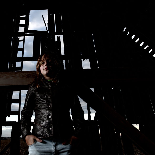
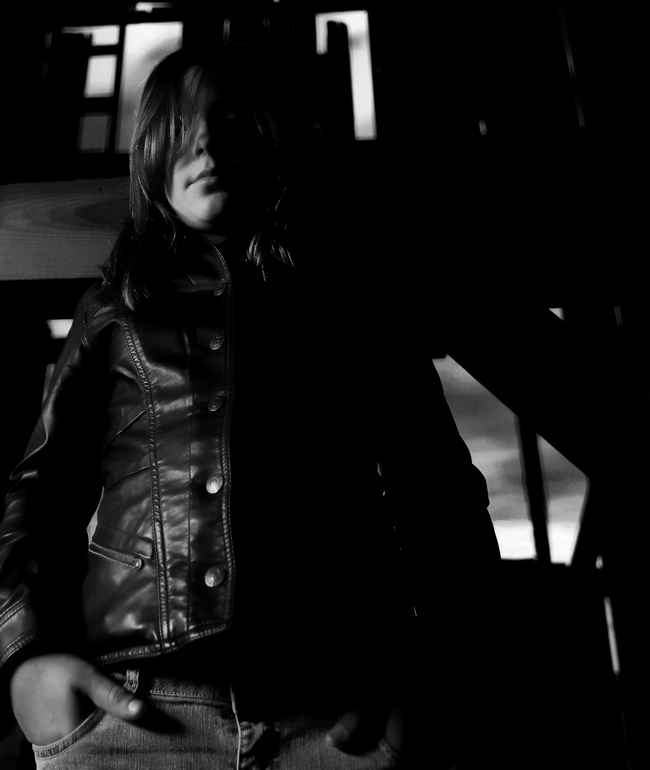
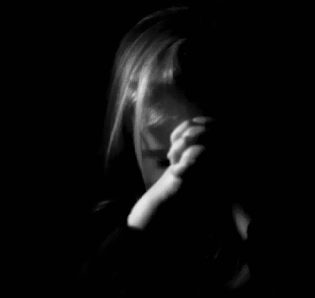
ParticipantSo, looking through the archives I’m wondering if shots like these are along the lines of what the theme is about. I kinda think so, but just checking before I tape my cat to the floor in a more posed setting.


//IIRC, my ‘Crying’ image from “The Song Remains the Same” is in the ballpark?
June 7, 2011 at 11:17 am #16916ParticipantRav, those are exactly what I am talking about.
June 7, 2011 at 11:45 am #16915ParticipantOh-righty then! I have others from each of these that I think might play better; except Blert’s; I really would need to tape him to the floor…but I thought it was so cool how he ‘stopped’ the sunbeam (bigger is of course better, in this instance.)
June 7, 2011 at 1:28 pm #16914Elsinore
KeymasterSee now I would have thought the second one was along the lines of the theme but the first and third don’t really demonstrate that same kind of deep shadow do they?
June 7, 2011 at 4:10 pm #16913ParticipantMy thoughts were more akin to Elsinore‘s so maybe I’m being overly tough on it.
June 7, 2011 at 7:43 pm #16912ParticipantSee now I would have thought the second one was along the lines of the theme but the first and third don’t really demonstrate that same kind of deep shadow do they?
I know what I had in mind when I proposed the theme, but that is hard to translate to the canvas of Fark. So, for my 2cents, a photo with clear elements centering on the interplay of light and shadow qualifies. Rav’s third photo is the least pertinent to the theme, but the first two are good, the second is dead on the money.
The harder the criteria the less the participation, the more difficult to moderate is my motto.
June 7, 2011 at 8:48 pm #16911ParticipantI actually thought #3 was kinda ‘not’ themish; threw it in for evaluation purposes.
As for the other two, this may be where or why b/w seems more effective for this type of photography.
The cat pic is easy enough to convert to b/w; in the other session, I started early in color, but actually switched to b/w so I can’t directly flip it; but I have a not-so-perfect comparable shot.
Non of these images are really what I’m working with for the contest (close, though), but I’m trying to see what kind of boundaries we’re working in. FWIW, I have to agree with ennuipoet on the criteria/participation comment.


b/w also allows a bit more liberty in contrast refinements, IMO.
June 11, 2011 at 6:55 pm #16894U-Man
ParticipantWe’re all getting to the same page. Rav’s #2 is spot-on. #1 in color is OK and when switched to b&w with more contrast definitely works. I wouldn’t vote for #3 because it doesn’t fit the spirit of the theme well enough.
Browsing through my image host…do these fit?
http://photos.imageevent.com/ulle17/fark/L_6988.jpg
http://photos.imageevent.com/ulle17/fark/Low-Key_6991a.jpg
http://photos.imageevent.com/ulle17/fark/Ems_5526.jpg
http://photos.imageevent.com/ulle17/fark/Now-I-lay-Me-Down-To-Sleep_0241-R.jpg (I have to re-do this one with different technique. I like it but it’s not quite there…)
http://photos.imageevent.com/ulle17/fark/Related_9471a.jpg (too light?)June 12, 2011 at 12:04 am #16893ParticipantEms_5526 seems PERFECT to me. Please say that’s something like what we’re going for here.
June 12, 2011 at 2:38 am #16892ParticipantThe wiki article + a variety of photo blogs give some good examples and definitions of Chiaroscuro for anyone still questioning their entries.
June 12, 2011 at 12:39 pm #16891ParticipantSo here is the basic gist: My idea was photographs with a strong, single direction light source illuminating specific areas of the subject while leaving the remainder in deep shadows.
http://www.flickr.com/photos/ennuipoet/5428168758/
U-Man all of them fit within my broad parameters of the theme but 6991a, 5526 and 9471a are most consistent with what I envisioned.
Again, I believe in broad interpretation of a theme to permit maximum participation and easiest moderation. So any photograph with strong elements of light and shadow fits in my book.
-
AuthorPosts
- The topic ‘06-15-11 – In Deep Shadow’ is closed to new replies.