Forums › Forums › Farktography General Chat › This week’s contest › 07-14-10 – Black, White, & Grey All Over
- This topic has 152 replies, 22 voices, and was last updated 15 years, 11 months ago by
U-Man.
-
AuthorPosts
-
June 21, 2010 at 4:37 pm #29724
Kestrana
ParticipantOrionid thats exactly the sort of thing I had in mind.
June 21, 2010 at 7:00 pm #29725 orionidParticipant
Gotcha. Thanks.
June 21, 2010 at 8:15 pm #29726ravnostic
ParticipantElseIf I took a picture of the picture, and made it obviously so, would it be eligible for a future contest? Elsewise, I’m going to have to borrow my youngest niece or a cousin, recompose, and de-saturate (I think it’s a cute shot at a cute angle; kids are only 2 once.)
Kestrana and Else I think perhaps my monitor settings aren’t as saturated as yours. In my example pic, the dust/dirt looks pretty grey to me, not brown. Under ‘monitor’ settings I’m at 32bit, under color management I’m using sRGB. Are there better setting to choose?
I ask as perhaps my other ‘good candidates’ aren’t so good as I suppose. Don’t want to blow my entries with stuff other people see that I don’t. Example, I was planning to use a bigger version of this:
http://fossilspringsaz.com/pics/2010/jun/20/IMG_4091websmall.jpg
(one of my b-sides from ‘Pan’; even when I kick up the saturation I don’t see much color; leaves go olive green at best.)
June 21, 2010 at 9:12 pm #29727Elsinore
KeymasterI think a picture directly of a picture like that is stretching the spirit of the “You must be the original photographer” rule.
The photo you linked to definitely looks black/white/gray to me and would fit as long as it wasn’t shot in or converted to monochrome.
June 21, 2010 at 9:45 pm #29728ParticipantNope, just a cloudy day on Feb 28th before spring colors hit. There is color there–just not much (which is why I didn’t use it in ‘Pan’)
Time to hunt down a neice or cousin’s kid. One must be prepared…
June 22, 2010 at 2:01 am #29729LeicaLens
ParticipantI need more reference here. Would either of these be OK? I was sorting thinking of submitting the umbrella pic. The colour stands out, because it is the only colour in the picture. Would that make it invalid?
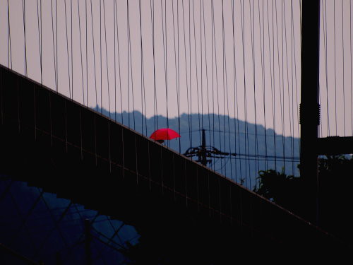
Too brown?
 June 22, 2010 at 3:02 am #29730Participant
The second one is fine but the first one is not at all what I was thinking, sorry. Neat picture though.
June 22, 2010 at 7:01 am #29731ParticipantOkay, thanks. I think this is going to be a search the archives kind of competition for me.
June 22, 2010 at 10:32 am #29732ParticipantKestranaAt work viewing on a different monitor; see what you mean about the car engine shot. Great, now I want a better monitor
July 11, 2010 at 4:10 am #29733U-Man
ParticipantDamn. I’ve been so busy that I didn’t even look at this theme. It’s cool. I like the idea.
I, too, need some direction. Which of these fit and which are ‘right-out’? I just did a quick run though my on-line files. Hell, I may have used some of these before. I’m just trying to stay out of trouble. 🙂
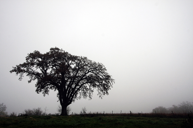
1 – http://photos.imageevent.com/ulle17/fark/Tree_0302t.jpg
2 – http://photos.imageevent.com/ulle17/fark/E_6408c.jpg
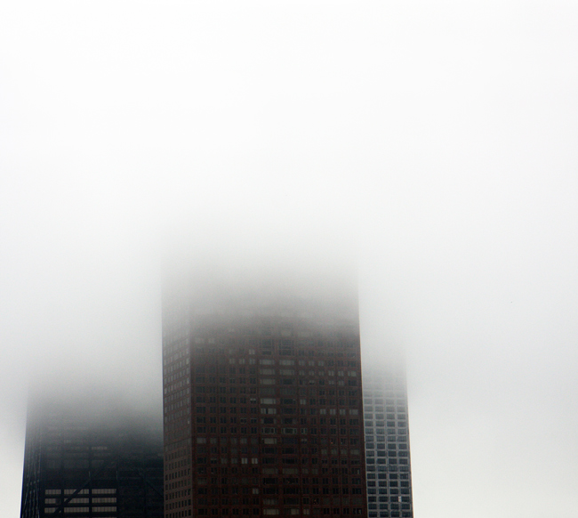
3 – http://photos.imageevent.com/ulle17/fark/Chicago_7886.jpg
4 – http://photos.imageevent.com/ulle17/fark/Fog_0141a.jpg
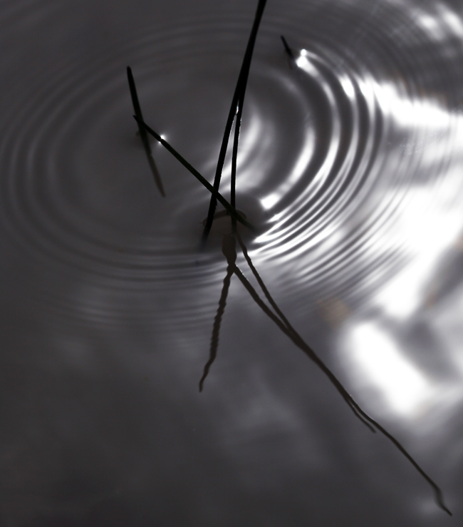
5 – http://photos.imageevent.com/ulle17/fark/Reeds_1209.jpg
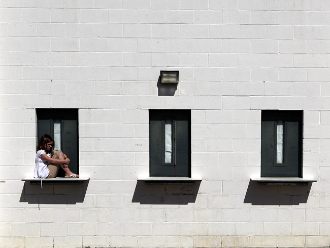
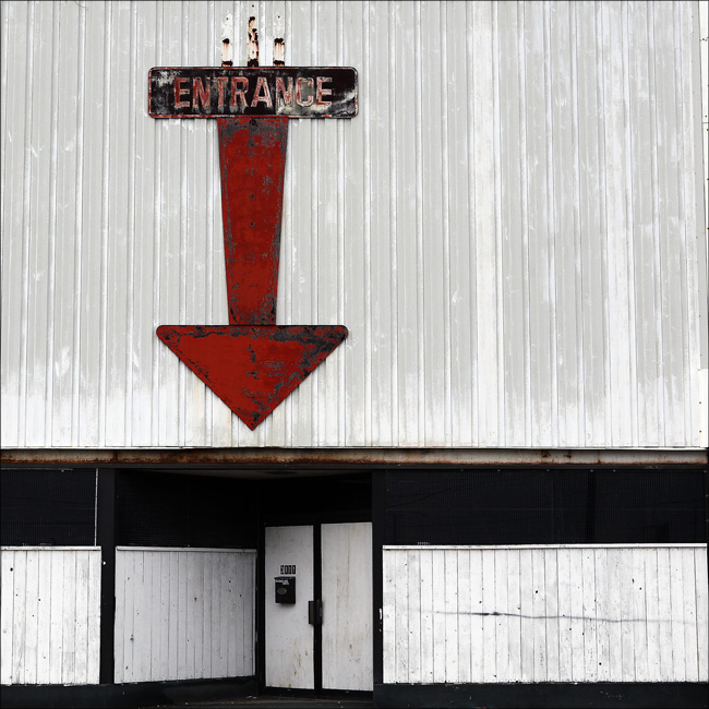
6 – http://photos.imageevent.com/ulle17/fark/Entrance_5857_1.jpg
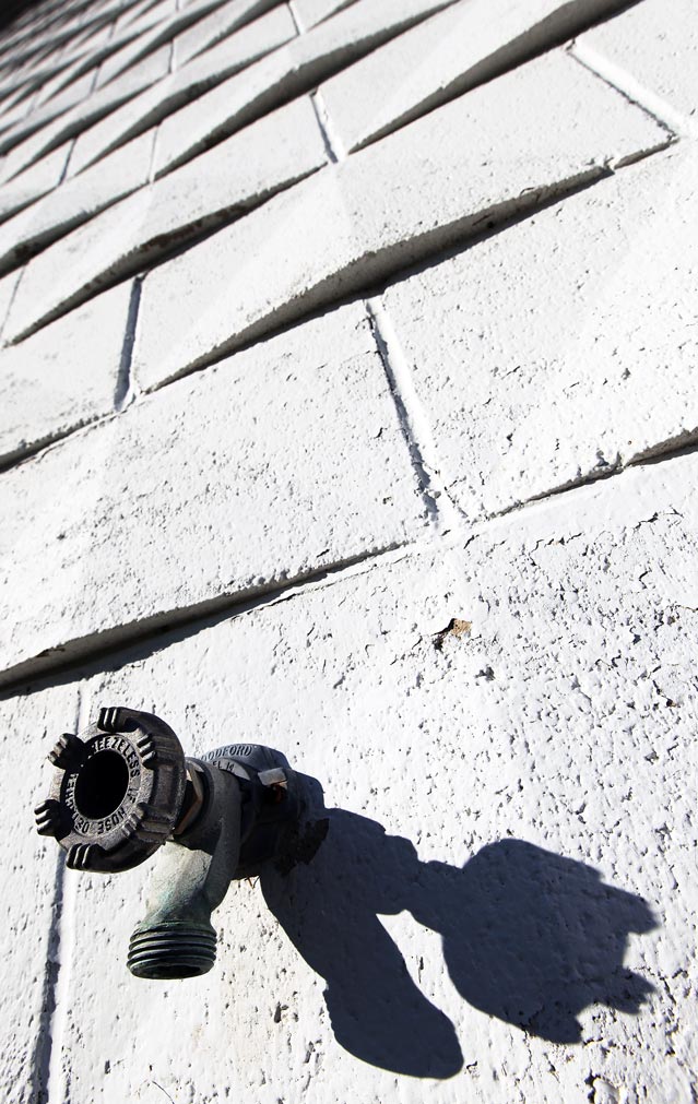
7 – http://photos.imageevent.com/ulle17/fark/Faucet_6132_1.jpg
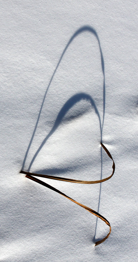
8 – http://photos.imageevent.com/ulle17/fark/Winter-Reeds_7134.jpgJuly 11, 2010 at 4:57 am #29734Participant1 – fine
2 – out
3 – would be fine if it wasn’t for the pink on the top of the Tribune Tower
4 – borderline but ok by me
5 – fine
6 – out
7 – fine
8 – outJuly 11, 2010 at 8:02 am #29735ParticipantThis has been a frustrating –but interesting– theme to shoot for. Looking at the LCD on the camera, a picture may look fine, but when seen close up and bigger on the computer, I find splashes of colour have crept in.
Damn you, green grass/trees, and red bits of metal.July 11, 2010 at 12:34 pm #29736ParticipantVery tough contest. Query: I understand messing with saturation goes against the grain of the theme. But what about overall adjustments in color temperature? I have a very nice shot of monsoon clouds nearing sunset that, when adjusted to 3100K, might work for this contest (I think it’s a close call, but then the theme is ‘could be mistaken for b/w’; but I’ll leave that up to you. Along with some other ‘please yeay or nay these’)
1. http://fossilspringsaz.com/pics/2010/jul/14/oceanbirdswebsm.jpg *
2. http://fossilspringsaz.com/pics/2010/jul/14/camerabagsm.jpg
3. http://fossilspringsaz.com/pics/2010/jul/14/cloudswebsm.jpg*note–taken with p+s; no ‘temp setting’ controls to use.
July 11, 2010 at 1:17 pm #29737ParticipantThanks K. That clarifies things. For whatever reason, my brain focused on the …vast majority of your picture… part of the description rather than on the … that could be mistaken for black and white… part.
July 11, 2010 at 2:00 pm #29738ParticipantThe part about saturation is just that I don’t want someone taking a color photo of say, a scarlet macaw and sucking all the saturation out of it and thinking that’s the point of the theme. You can do it if it’s reasonable like any other contest. I gotta run to church but I’ll check out your pics later.
-
AuthorPosts
- The topic ‘07-14-10 – Black, White, & Grey All Over’ is closed to new replies.