Forums › Forums › Farktography General Chat › This week’s contest › 09-03-08 – Terminal Madness
- This topic has 66 replies, 24 voices, and was last updated 17 years, 10 months ago by
Elsinore.
-
AuthorPosts
-
September 1, 2008 at 7:05 pm #18270
Uranus
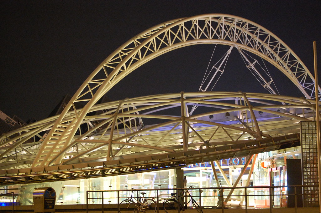
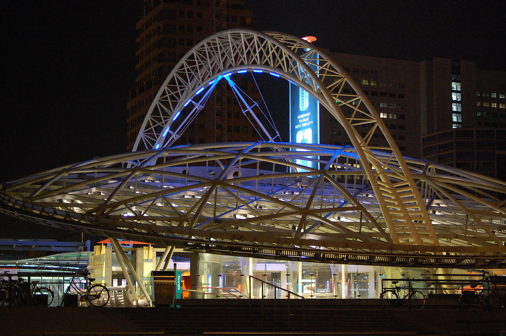
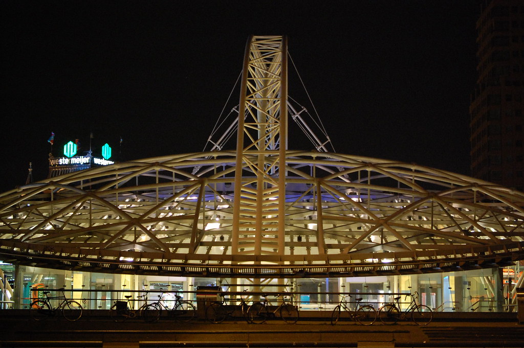
Participant3 shots, same subject. could post all 3 – i like them all – but would like to pare it down to just 1. comments, suggestions and hardcore critcism from farktography greats (yup, that’s you. you too.) would be appreciated
http://farm4.static.flickr.com/3253/2818785714_72d5711213_b.jpg
http://farm4.static.flickr.com/3095/2818789466_fb15026cb9_b.jpg
http://farm4.static.flickr.com/3170/2818787520_c82bbf48e9_b.jpg/courtesy of flickr.
September 1, 2008 at 7:18 pm #18271corsec67
Participant3 shots, same subject. could post all 3 – i like them all – but would like to pare it down to just 1. comments, suggestions and hardcore critcism from farktography greats (yup, that’s you. you too.) would be appreciated
http://farm4.static.flickr.com/3253/2818785714_72d5711213_b.jpg
http://farm4.static.flickr.com/3095/2818789466_fb15026cb9_b.jpg
http://farm4.static.flickr.com/3170/2818787520_c82bbf48e9_b.jpg/courtesy of flickr.
I like the second one, probably because of the lighting. The third one seems a bit awkward with the vertical beam facing the camera.
September 1, 2008 at 9:54 pm #18272linguine
ParticipantId go with the 2nd one too, the inside of the building seems a little too bright in the first one.
September 2, 2008 at 1:05 am #18273RcMacStudent
ParticipantI like the second one, probably because of the lighting. The third one seems a bit awkward with the vertical beam facing the camera.
Yup
September 2, 2008 at 4:29 am #18274Choc-Ful-A
ParticipantRegarding Uranus‘s three images, I agree that the third one is tricky but I prefer the first over the second. Here why…
While there’s a lot of nice features in the photo, like the bikes, the saucer shape of the roof, the blue/purple light from the sign, the glowing interior of the terminal and the buildings in the background, I think the strongest element is the arching support beam. So if you consider which of the three allows you to display that arch the best it’s the first one. The reason I like the first over the second is that the side of the arch facing facing the camera is lit better in the first one. In the second picture, the arch is more backlit, which makes it harder to make it the dominant part of the image. It’s also competing with the blue-letters of the sign in the second one.
But I played with all three and cropped them to draw attention to the arch and they are look interesting that way. The crop I liked on the first one has the right edge place to cut out the vertical pole (which is a bit distracting), the left edge chosen to cut out the mailbox (or whatever that is) since the scale of that element is odd by comparison. You do loose the sense of the saucer shaped roof line, but I think highlighting the dramatic shape of the arch is worth the trade-off.
Just my opinion of course, I mean no offense by suggesting that interesting elements be cropped out.
PS – The light level inside the building can be effectively changes with “curves” too if that bothers you.
September 2, 2008 at 7:01 pm #18275Participantamazingly, there was very little light indeed. the camera of gratuitous mystery picked it up, added highlights….really weird. cool, but weird.
thanks, all of you. I’ll get some wider shots, maybe with/from some decent elevation, so you can see how cool this spaceship really is. I’m still probably going to wind up tossing a coin,though 😳
September 2, 2008 at 7:36 pm #18276U-Man
ParticipantIn my search for ideas for this theme I typed “terminal” on dictionary.com. One definition regarding architecture referred to a “herm”. I was curious about this word. Here’s what the dictionary says – http://dictionary.reference.com/browse/herm (1st definition).
Odd.
September 2, 2008 at 9:07 pm #18277schnee
ParticipantIn my search for ideas for this theme I typed “terminal” on dictionary.com. One definition regarding architecture referred to a “herm”. I was curious about this word. Here’s what the dictionary says – http://dictionary.reference.com/browse/herm (1st definition).
Odd.
That would certainly add a new tone of this theme.
September 2, 2008 at 10:56 pm #18278jpatten
ParticipantI have NOTHING for this contest….
September 2, 2008 at 11:07 pm #18279ParticipantI have NOTHING for this contest….
Take a picture of your computer.
(at least the monitor and keyboard part)Take a picture of any of the ends of the cables that plug into your computer.
And that is all without going outside to a airport/bus/train terminal.
September 3, 2008 at 2:13 am #18280jekxrb
ParticipantWell my dad happened to be heading out on a business trip this afternoon so I went out with the ‘rents, said goodbye to him, then dragged my mother around the terminal. Unfortunately there weren’t any great shots, although I do think I have a somewhat humorous one that fits the terminal ‘madness’ part. It’s not great photography, though. Meh. Next week will be better. I hope. I tried to convince my mother to make a small child cry, as I liked the idea of a picture of a small soul screaming his or her head off in the middle of chaos and baggage (well, baggage, anyways, there was depressingly little chaos), but she declined and every child we saw was unfortunately happy. Great for travelling parents, not so great for me.
September 3, 2008 at 11:25 pm #18281ParticipantAre these shots of ports terminalish enough for the theme?
http://www.flickr.com/photos/guine/sets/72157607099356003/September 3, 2008 at 11:35 pm #18282Elsinore
KeymasterI think so, ‘guine.
September 3, 2008 at 11:44 pm #18283soosh
ParticipantIt just now occurred to me that glaciers have a terminal end.
I’ve got some airport photos that I love that I want to use, but just throwing that out there for anybody else.
September 4, 2008 at 12:09 am #18284KeymasterContest linky:
http://forums.fark.com/cgi/fark/comments.pl?IDLink=3847293 -
AuthorPosts
- The topic ‘09-03-08 – Terminal Madness’ is closed to new replies.