Forums › Forums › Farktography General Chat › This week’s contest › 09-09-09 – Farktography Classic: Less is More 2
- This topic has 97 replies, 17 voices, and was last updated 16 years, 7 months ago by
Elsinore.
-
AuthorPosts
-
September 7, 2009 at 7:59 am #24014
olavf
ParticipantTo add (?) to U-Man, if the leaves were more bokehed, I think it’d be a much better shot for this contest. I really, really like it in general but the leaves detract from the subject, I think.
But also, I’m not an art critic by any means. And, I suspect at least one of my entries will seem ‘busy’ to some as it’s panning out.
September 7, 2009 at 8:45 am #24015corsec67
ParticipantSomething like this perhaps? Would this fit the bill?
http://i141.photobucket.com/albums/r69/clouddancer19/trillium.jpg
If you put a sheet of paper behind the flower, so that it was an isolated flower, …
Not like I am an expert or anything.
September 7, 2009 at 2:28 pm #24016clouddancer
ParticipantOk. Gotcha. That’s about as simple as I have them here, so I will just have to look for something else. I can’t recreate the picture because that one was taken last year and those flowers only come out in the spring. I tried to crop it so that it was mostly just the green of the leaves and then the trillium bud, but I wasn’t happy with that because I thought too much of the picture was then taken up by the bud.
Thank you for the direction.
September 7, 2009 at 5:36 pm #24017lokisbong
ParticipantIs this is what we are trying for?
http://www.flickr.com/photos/34626556@N02/3895540402/
or this?
http://www.flickr.com/photos/34626556@N02/3895533390/
Edited to add second link.September 7, 2009 at 6:54 pm #24018sleeping
ParticipantSleeping’s quick minimalism guidelines:
1) The subject should be either quite small, or very simple (geometric shapes, simple repeating patterns etc)
2) The background should be simple/plain (sky and water are often good, snow is just about perfect, but bokeh often doesn’t work as well as you might think)
3) The subject and background should be distinctly different
4) Fewer colors = more minimal (but they don’t have to be black and white)September 7, 2009 at 7:19 pm #24019ParticipantSleeping’s quick minimalism guidelines:
1) The subject should be either quite small, or very simple (geometric shapes, simple repeating patterns etc)
2) The background should be simple/plain (sky and water are often good, snow is just about perfect, but bokeh often doesn’t work as well as you might think)
3) The subject and background should be distinctly different
4) Fewer colors = more minimal (but they don’t have to be black and white)and some, but not necessarily all these elements.
/some of mine won’t have backgrounds this weekSeptember 8, 2009 at 12:17 am #24020Participantand some, but not necessarily all these elements.
/some of mine won’t have backgrounds this weekFor sure. They’re not not the One True Path to minimalism, either, but I think they ought to work. But making that into a good photo on the other hand is not necessarily easy…
September 8, 2009 at 3:58 am #24021U-Man
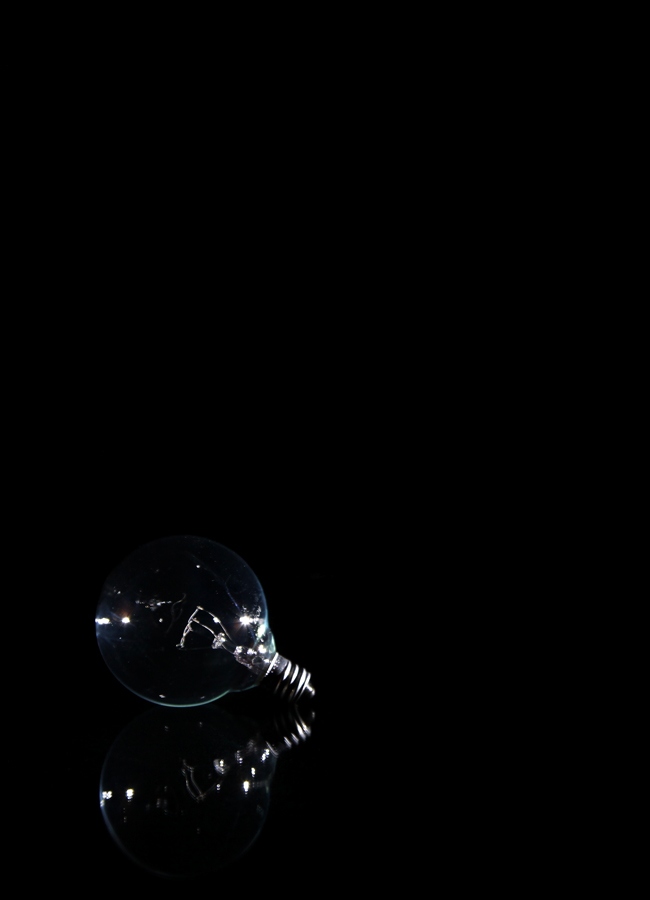
ParticipantA while back (a year or two), one of you technically savvy farkers had a post about how you got a photo of a wine glass with a black background and no flash-spots on the glass. The flash was hidden away and bounced somehow. Well, I just tried this – http://photos.imageevent.com/ulle17/fark/Bulb_5200.jpg – for the minimalism theme and am unsatisfied because of the lighting. The bulb is on black cloth that gently curves up to where I tacked it to the wall. I hand held a flash from the side to illuminate the bulb but had cardboard baffles to cast shadow on my backdrop as well as just beneath the bulb.
Oh – and the bulb is on a piece of glass. That’s how the reflection got there.
Anyway, can anybody point me to that thread. Was is schnee? Or morningbreath? Bobroberts?
September 8, 2009 at 4:21 am #24022Participantand some, but not necessarily all these elements.
/some of mine won’t have backgrounds this weekFor sure. They’re not not the One True Path to minimalism, either, but I think they ought to work. But making that into a good photo on the other hand is not necessarily easy…
oh, absolutely not. But it’s definitely a good way to start thinking, and some good general ‘rules’ (if there be such a thing)
*edited to add: I said nearly the same thing to someone earlier that refuses to come to the .net threads for whatever reason. Before I saw your post.I’ve twisted my head in a know because it’s a broad idea with very loose rules. It’s definitely been fun though, and I hope this contest is a hit.
U-Man, do you have a light box? I’d start there, and maybe add a sheer cloth on top to make it more diffuse. Then start moving lights around so they don’t reflect :/
September 8, 2009 at 4:42 am #24023ParticipantIt’s definitely been fun though, and I hope this contest is a hit.
U-Man, do you have a light box? I’d start there, and maybe add a sheer cloth on top to make it more diffuse. Then start moving lights around so they don’t reflect :/
Firstly – I agree.
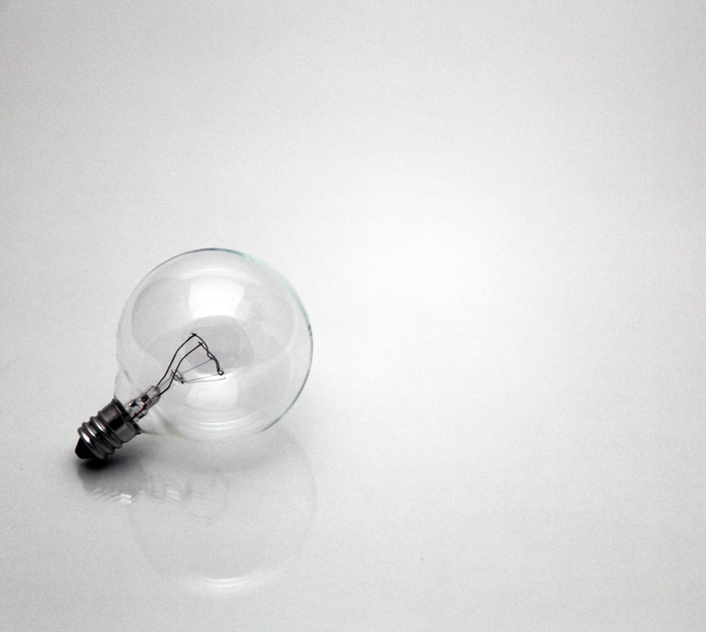
Secondly – Yeah, I have a light box. I actually started out with the bulb there – http://photos.imageevent.com/ulle17/fark/Bulb_4998.jpg – and didn’t like the reflection. I wanted it cleaner. That’s what caused me to try a black version.duh – I haven’t even tried a Google search…
September 8, 2009 at 5:04 am #24024ParticipantSomewhat interesting. http://www.tabletopstudio.com/documents/glass_photography.htm
September 8, 2009 at 5:44 am #24025ParticipantI hadn’t thought of the black paper, but the two lights, further back from the box so it’s more diffuse would be my starting place. I’ll sometimes use all three of my studio lights farther back to get enough light, but not from any direct source.
/and great find. I like the idea of the tabletop lightSeptember 9, 2009 at 12:23 am #24026soosh
ParticipantU-Man, try diffusing your flash more. some low-budget diffusers that I have used include circles of 1-gallon milk jugs (you can stack them for more and more diffusing) or even just kleenex/white tissue paper over the flash.
What do y’all think of this for the minimalism theme? It was taken on a damned cold day, directly into the winter sun, which was filtered by fog. The ocean surface is frozen, somewhat, which is why it seems like there is a hill leading to the two small boats, which had guys breaking ice away from salmon hatchery stuff. This is a color photo.
http://sacredartichoke.com/coppermine/albums/08-25-2009-random/IMG_4801.jpg
I like this one, too, but not sure if it’s minimalist enough.
http://sacredartichoke.com/coppermine/albums/02-14-2009/IMG_1128.jpg
September 9, 2009 at 12:54 am #24027nobigdeal
ParticipantU-Man, try diffusing your flash more. some low-budget diffusers that I have used include circles of 1-gallon milk jugs (you can stack them for more and more diffusing) or even just kleenex/white tissue paper over the flash.
What do y’all think of this for the minimalism theme? It was taken on a damned cold day, directly into the winter sun, which was filtered by fog. The ocean surface is frozen, somewhat, which is why it seems like there is a hill leading to the two small boats, which had guys breaking ice away from salmon hatchery stuff. This is a color photo.
http://sacredartichoke.com/coppermine/albums/08-25-2009-random/IMG_4801.jpg
I like this one, too, but not sure if it’s minimalist enough.
http://sacredartichoke.com/coppermine/albums/02-14-2009/IMG_1128.jpg
Nice shots but I’m not sure if they are technically minimalist. The first one has too much distraction at the bottom. Maybe crop out the bottom and the left side just keeping the boats.
The second one has way too much going on for my taste.
This guys work is what I think of when I think minimalist and is what I am using as a template for this week.
September 9, 2009 at 2:43 am #24028justkat
ParticipantThis guys work is what I think of when I think minimalist and is what I am using as a template for this week.
interesting stuff. to my mind the trick with those kinds of photographs is to make them compelling. some of his are and some are not. not really criticizing too much, i’m in no position to throw stones lol. I don’t think I could put into words where that line is that makes something remain minimal and yet not be soooo abstract as to fail to engage the viewer. I suspect I’m going to err on the other side 😉
-
AuthorPosts
- The topic ‘09-09-09 – Farktography Classic: Less is More 2’ is closed to new replies.