Forums › Forums › Farktography General Chat › This week’s contest › 11-24-10 – Farktography Classic: Autumn II
- This topic has 67 replies, 20 voices, and was last updated 15 years, 7 months ago by
 orionid.
-
AuthorPosts
-
November 25, 2010 at 6:59 am #34128
Plamadude30k
ParticipantTo be quite honest, I’m really disappointed with my entries for this week. Even more so now that I’ve seen what other people have. On that note, however, I have to say Rav and U-man have some really spectacular shots, and I particularly liked the one from yaced with the waterfall.
November 25, 2010 at 7:00 am #34129Elsinore
KeymasterNo bother 🙂 Flickr only recently changed their layout and file size options a couple months back, so it still catches people from time to time.
November 25, 2010 at 7:04 am #34130LeicaLens
ParticipantAnd a few b-sides, for what it’s worth.
http://flic.kr/p/8VZV9k
http://flic.kr/p/8W3ZgU
http://flic.kr/p/8VZVg6November 25, 2010 at 7:13 am #34131ParticipantNo bother 🙂 Flickr only recently changed their layout and file size options a couple months back, so it still catches people from time to time.
Aye, and I had just signed up to Flickr right before they did that. Threw me for a right loop 😯
November 25, 2010 at 8:38 am #34132ravnostic
ParticipantI’m liking the entries so far, in particular Mopsy, Eden… (the blurry one), and Because I Said So had ones I particularly enjoyed.
Thanks, rav! If you liked those, all of my bees are from that same trip.
And while I echo the sentiments on your fencepost shot, your Golden Toasted Sunset was the one that grabbed my eye first. The leaves are almost like little flames licking up from the bed of stones, aren’t they?
Love the B’s, Cause! GTS was named for the fact it looked like little back-lit toasted corn flakes. Taken just outside my apt about 6 weeks ago, it was a serendipity shot. Glad you liked!
[edit–thanks Plamadude, as well. :-)]
November 25, 2010 at 1:34 pm #34133ennuipoet
ParticipantI like pretty much all of these. 🙂
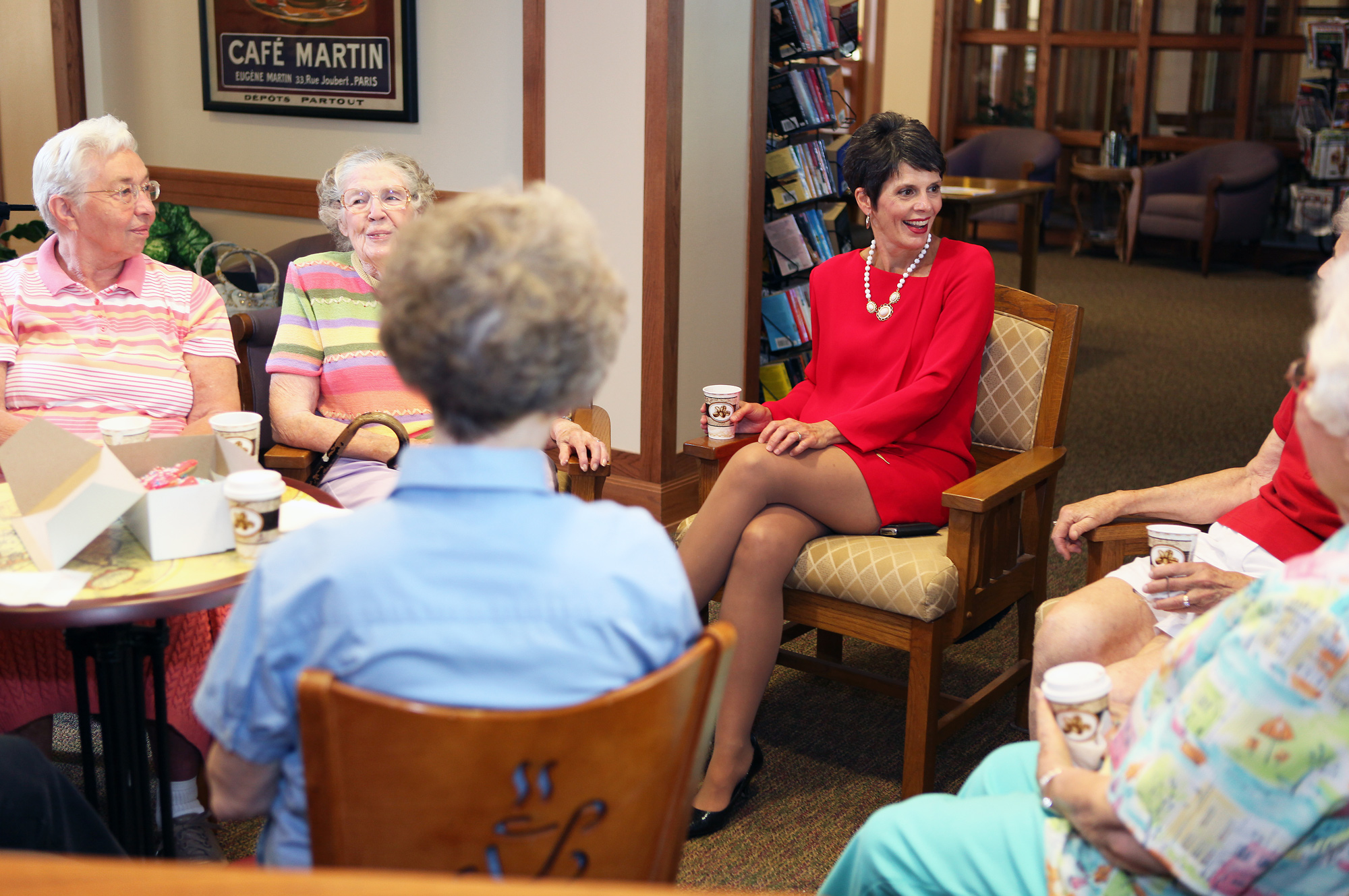
Hey. This theme made me remember a question I have. My Canons seem to have trouble with largish, relatively uniform red-red things. They get blown out in relation to the rest of the frame.
Example – http://photos.imageevent.com/ulle17/peopleplaces/m_7822.jpg
Check out the red dress. It featureless in this pic but not in real life. Any input? (I spent an afternoon taking pics of this dynamic lady for a mail-out thing she did while running for county board.)
It’s definitely a Canon thing, I spend a lot of time in Software trying to compensate for the problem. If it is a shot I care about, I usually do a two layer in Photoshop, adjust each layer to the point I like and then erase and merge. I’m sure there are easier ways, and if anyone has them I’d love to hear it. I’m actually glad to know that is is not just my camera.
November 25, 2010 at 2:05 pm #34134SilverStag
ParticipantI like pretty much all of these. 🙂
Hey. This theme made me remember a question I have. My Canons seem to have trouble with largish, relatively uniform red-red things. They get blown out in relation to the rest of the frame.
Example – http://photos.imageevent.com/ulle17/peopleplaces/m_7822.jpg
Check out the red dress. It featureless in this pic but not in real life. Any input? (I spent an afternoon taking pics of this dynamic lady for a mail-out thing she did while running for county board.)
It’s partially a Canon software issue, but more fundamentally it’s a sensor/IR issue. Look at this (somewhat technical) article over at dXo labs:
Note the narrower bandwidth of the red channel, then consider that the built-in IR filter chops off some of that at the far-right; the result is less “range” in the red channel, and easier “blocking/saturation” of the reds (and colors that are red-dependent, such as purple and orange).
The sensor/filter sensitivities are inherent in how CMOS sensors are made; I’m less sure about other processes.
Hope this helps 🙂
November 25, 2010 at 3:17 pm #34135KeymasterIt’s definitely a Canon thing, I spend a lot of time in Software trying to compensate for the problem. If it is a shot I care about, I usually do a two layer in Photoshop, adjust each layer to the point I like and then erase and merge. I’m sure there are easier ways, and if anyone has them I’d love to hear it. I’m actually glad to know that is is not just my camera.
I’m not sure whether that kind of treatment would be in keeping with Farktography rules, though. I guess you could argue that it’s a color correction?
November 25, 2010 at 7:20 pm #34136U-Man
ParticipantThanks for the nice comment Plamadude. I assume you’re referring to the leaf. Seeing how my other two are doing makes me wish I had used one or two of my other leaves. But I try to have three different type pics for each theme. Plus, I like my other two. I knew the fall orchard would be a bit lame because it has no 640 px ‘POP’. That’s OK.
Thanks to all who responded to the Canon red issue. That info fits my experience. Els, I haven’t thought it through, but I don’t think I want to open the Photoshop layers issue for this. It might be a slippery slope. If I run into this issue in the future and just have to tweak the red, perhaps I can get an OK for that pic in advance.
November 25, 2010 at 7:23 pm #34137ParticipantLike ennuipoet, I would like to know how others post process this. I have done Q & D stuff with a really light Burn Tool.
November 25, 2010 at 7:29 pm #34138KeymasterI think what concerns me about layers is that it’s kind of like compositing different exposures, which is too similar to HDR for my tastes. But I’m open to a clarifying discussion (probably should put it on another board/thread, though!). I don’t use a lot of that kind of post processing myself, mostly just curves, contrast, saturation, and unsharp mask.
November 25, 2010 at 9:57 pm #34139ParticipantIt’s definitely a Canon thing, I spend a lot of time in Software trying to compensate for the problem. If it is a shot I care about, I usually do a two layer in Photoshop, adjust each layer to the point I like and then erase and merge. I’m sure there are easier ways, and if anyone has them I’d love to hear it. I’m actually glad to know that is is not just my camera.
I’m not sure whether that kind of treatment would be in keeping with Farktography rules, though. I guess you could argue that it’s a color correction?
I don’t do it Farktography posts, that amount of post-processing while technically color correct is to much for honesty. I use the two layer method for shots that I want to improve. This shot hasn’t had the alteration, but really should
http://www.flickr.com/photos/ennuipoet/5143595853/in/photostream
The only color correction I do in Farktography is vibrance and saturation in Lightroom.
November 25, 2010 at 11:18 pm #34140Choc-Ful-A
ParticipantI think what concerns me about layers is that it’s kind of like compositing different exposures, which is too similar to HDR for my tastes. But I’m open to a clarifying discussion (probably should put it on another board/thread, though!). I don’t use a lot of that kind of post processing myself, mostly just curves, contrast, saturation, and unsharp mask.
I generally restrict my Farktography post-processing to those same tools and aside from images scanned from negatives (dust/dirt/scratch correction) apply the to the entire image. You can do quite a lot with curves in particular. In fact I think adjusting the “red” curve and then maybe desaturating the “red” color in the saturation tool would be an effective way to adjust the Canon images with overloaded red colors. Maybe it would be interesting to post before/after photos? Or even setup a thread where people could submit images and we could all post our suggestions for how we would adjust them?
November 25, 2010 at 11:26 pm #34141mopsy
ParticipantElsinore, you mention “curves” in post processing. That’s the second time I have heard that process lately. I know I’m showing my lack of experience, but where is that. It’s probably real obvious and U-Man is shaking his head.
November 25, 2010 at 11:49 pm #34142ParticipantElsinore, you mention “curves” in post processing. That’s the second time I have heard that process lately. I know I’m showing my lack of experience, but where is that. It’s probably real obvious and U-Man is shaking his head.
I use Gimp, so I don’t know how to get to the curves tool in Photoshop. But a couple Google searches says it’s “Image -> Adjustments -> Curves” to bring up the tool. Once you’ve done that the info on this page might be helpful. The site pops an midly annoying request for your e-mail address, but the info is pretty good IMO. And you basically play around with the shape of the curves until you like the results in case you’d rather just wing it. 🙂
I would recommend getting the master levels the way you like first, meaning the one that changes all channels. Then pick another channel, like “red”, and refine the look from there.
-
AuthorPosts
- The topic ‘11-24-10 – Farktography Classic: Autumn II’ is closed to new replies.