Forums › Forums › Farktography General Chat › This week’s contest › 01-19-11 – Color Popping Naturally
- This topic has 222 replies, 26 voices, and was last updated 14 years, 12 months ago by
Kestrana.
-
AuthorPosts
-
January 18, 2011 at 11:48 pm #36150
mopsy
ParticipantPlamadude30k, it’s fine. I also think that because some monitors may show different shades of gray we need to be a little less judgemental. That being said, the entires still needs to have the element of an object’s color popping right out at you.
January 19, 2011 at 12:57 am #36151ravnostic
ParticipantAlso, Ravnostic: There’s a glitch in the matrix. Your leftover lasagna has been swapped for an apparently delicious burning building.
Damn–I hate when I do stoopid stuff like that! Pulled the file. Did some file renames, uploaded, and fergetted I’d posted that file name. Well, there’s one of three that won’t surprise anyone. 😳
January 19, 2011 at 1:26 am #36152zincprincess
ParticipantThat being said, the entires still needs to have the element of an object’s color popping right out at you.
Hmm… I think that eliminates one of my entries because the color doesn’t pop enough.
http://farm5.static.flickr.com/4074/4862077226_6eb38c9439.jpg
/edited to correct link fail.
January 19, 2011 at 1:53 am #36153Participantzincprincess, sure it does. Thats fine. It’s clearly and cleanly defined from the white background. Can’t get more color popping than that unless your cat was candy apple red!
January 19, 2011 at 2:05 am #36154ParticipantYou know, mopsy, I changed my selection up a wee bit, and colors do pop–I just wish I could change the color! I think the powerful bold colors are going to do better than my ocher yellow…and I never could get the teal fountain the way I wanted it (kestrana did, but she was working from an already-edited shot, which I couldn’t duplicate without the numbers being tweeked way too far out of proportion for my tastes.)
One of my bees is this one–but yellow surfboards have been done before, IIRC:
January 19, 2011 at 2:58 am #36155Participantravnostic, I like the use of yellow in color popping photos. I’ve been seeing a yellow VW running around town, but everything I see it parked somewhere the background is not grayscale or just too busy.
January 19, 2011 at 3:34 am #36156Elsinore
KeymasterPlamadude30k, it’s fine. I also think that because some monitors may show different shades of gray we need to be a little less judgemental. That being said, the entires still needs to have the element of an object’s color popping right out at you.
Allowances will definitely be made for monitor color differences. Unless the photo is a true b/w/monochrome with color popping (e.g. it’s been converted to b/w/monochrome with color pop in post processing) or the colors are really obviously not even an attempt at finding gray, then they’ll probably be fine.
January 19, 2011 at 5:27 am #36157ParticipantDamn. I remembered some shots I took at the state fair which turn out not to be what Pope was looking for per his latest comments. However, I think they may fit this theme–and replace a weakish entry I have instead.
Take a photo that appears to be black and white/grayscale with the exception of one object or color…
Before I decide, what if that ‘one object’ is a person, and that one person happens to be very colorful? Elsewise, the shot could be b/w.
//if that’s too far away from what mopsy is looking for, I’ll go with what I’d already selected.
January 19, 2011 at 6:02 am #36158KeymasterGiven some objects are multi-colored, I think a single object (or person) would fit, if the overall scene was otherwise black/white/gray.
January 19, 2011 at 4:09 pm #36159ParticipantAgree with Elsinore. In the original color popping theme, people were the object of color popping. So using the person to pop out at you is fine.
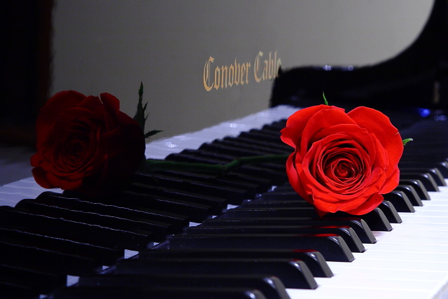
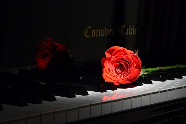
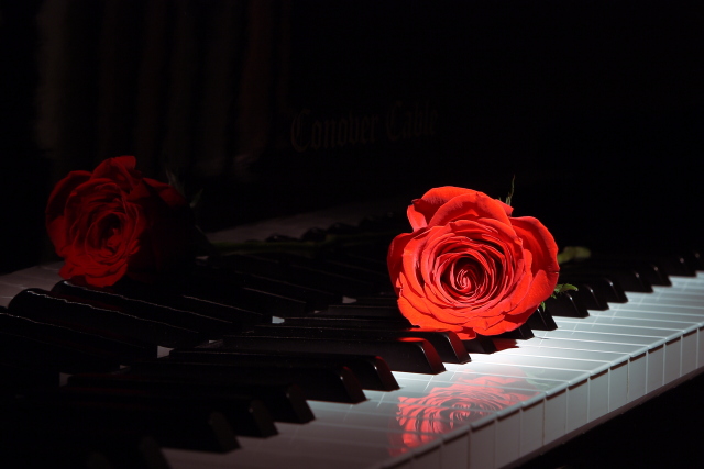
January 19, 2011 at 8:35 pm #36160CauseISaidSo
ParticipantJanuary 19, 2011 at 8:40 pm #36161KeymasterI think the third has the most convincing b/w with color pop effect. The gold piano manufacturer name is visible in the other two, though less in the second.
January 19, 2011 at 8:43 pm #36162lokisbong
ParticipantI think the third has the most convincing b/w with color pop effect. The gold piano manufacturer name is visible in the other two, though less in the second.
That was my opinion too. Great idea either way you go.
January 19, 2011 at 8:57 pm #36163 orionidParticipant
I like number two. Both as a whole, and for the theme.
January 19, 2011 at 8:59 pm #36164SilverStag
ParticipantDoes this pop enough?

-
AuthorPosts
- The topic ‘01-19-11 – Color Popping Naturally’ is closed to new replies.