Forums › Forums › Farktography General Chat › This week’s contest › 10-07-09 – Farktography Classic: Black and White 2
- This topic has 140 replies, 25 voices, and was last updated 16 years, 9 months ago by
justkat.
-
AuthorPosts
-
September 18, 2009 at 7:50 pm #24324
nobigdeal
ParticipantThe best B&W has lots of contrast and fills the frame of the photo. Large areas of blank space make for boring pictures. (Dark or light)
September 19, 2009 at 12:18 am #24325Elsinore
KeymasterIn SilverStag’s first photo, it does look more sepia toned to me, but the second where he boosted the blue in the shadows is very subtle, and I doubt anyone would notice the difference. If we want to keep it true black and white/grayscale as opposed to monotone/allowing various toning effects, we need to put that into the description, and just know that it’s going to be somewhat difficult to police given different monitors can impart different color casts….
September 19, 2009 at 12:51 am #24326sleeping
ParticipantLarge areas of blank space make for boring pictures. (Dark or light)
September 19, 2009 at 1:03 am #24327ParticipantLarge areas of blank space make for boring pictures. (Dark or light)
There’s exceptions to every rule 😉
September 19, 2009 at 2:47 am #24328clouddancer
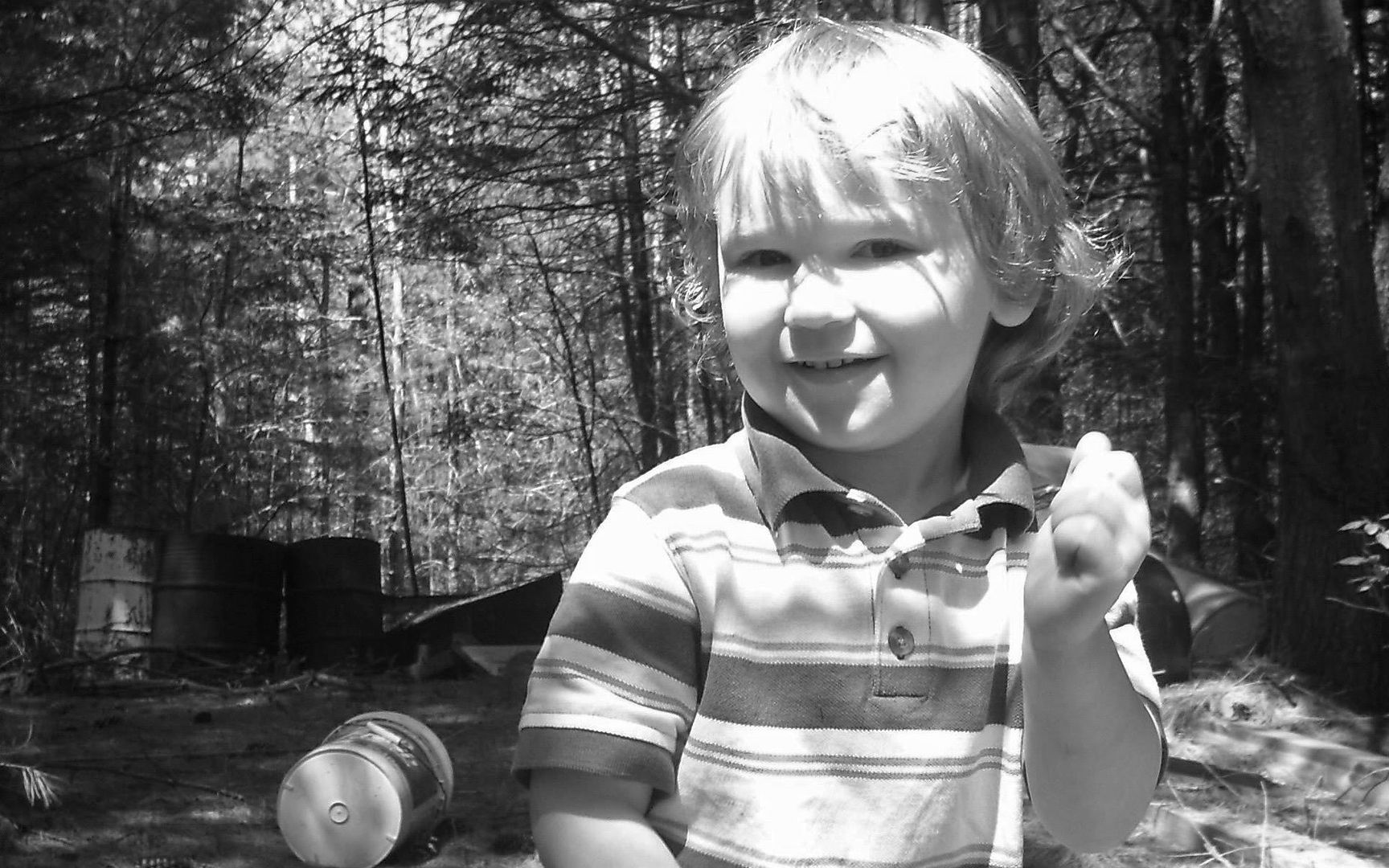
ParticipantWhich explains why when I played with sending this to BW as a change of pace for my desktop (I have a widescreen desktop, 16×10) it came out okay. Thoughts?
http://i141.photobucket.com/albums/r69/clouddancer19/Atrus/Barrelscolor.jpg
http://i141.photobucket.com/albums/r69/clouddancer19/Atrus/barrelsbw.jpgI won’t post a picture of Atrus, but it does appear that a not so empty picture worked rather well.
September 20, 2009 at 11:47 pm #24329justkat
ParticipantIt’s my feeling that a not-too-busy picture is also good? But i guess that’s true for color too. =P Sometimes things that look busy in color look less busy in B&W. I’s learning! lol
Keep desaturating your pix, clouddancer, and see what looks good! I’m still developing my eye for what will look good B&W *before* I take the picture, but I am learning…
September 27, 2009 at 4:57 am #24330U-Man
ParticipantI know I got the credit for this theme, but that’s just ’cause I suggested the do-over. I don’t feel like I have any authority. That being said, if you’re looking for a decision to be made, I say we do shades of gray. No other colors.
And Justkat, thanks for the vote of confidence. But I see through your kind words to the fiendish JINX that lies within. 🙂 I have no real input for you. Bounce around on the web and see what other photogs have done. Open up several pics that you have taken that you just like and desaturate them. See what works. During the Color Pop discussion, sleeping suggested using the ‘Channel Mixer’ in PS for different B&W effects. I’ve played with that and suck at it. It’s easier (but probably not as good) for me to desaturate and then mess with brightness and contrast. I find that alot of the stuff I desaturate looks better when I make it darker and more contrasty.
September 27, 2009 at 5:37 am #24331corsec67
ParticipantKeep desaturating your pix, clouddancer, and see what looks good! I’m still developing my eye for what will look good B&W *before* I take the picture, but I am learning…
I am going to enter 3 IR pictures for this contest, but I will need to desaturate them since the filters aren’t perfect.
That is harder to visualize, since IR is a frequency we can’t see, so I have to visualize it by using the camera, although I can get a pretty good idea before I break out the camera.
September 27, 2009 at 3:52 pm #24332ParticipantDuring the Color Pop discussion, sleeping suggested using the ‘Channel Mixer’ in PS for different B&W effects.
Actually, I recommended the Black and White tool which does basically the same thing, but tends to be a bit easier to use and has presets. (layer > new adjustment layer > black and white)
September 27, 2009 at 5:59 pm #24333ParticipantI think I read that wrong because until about a week ago I was using CS2. Just updated to CS4.
September 28, 2009 at 3:16 am #24334ParticipantThat Black and White tool is pretty neat. It can really change the mood of a B&W pic. I especially like what I can do to the sky. Thank you very much for pointing it out, sleeping.
September 29, 2009 at 10:06 pm #24335ParticipantI am going to do at least one landscape. But b&w is so good for dark, depressing, wrong, harsh photography that I want to do some shooting specifically with this mood. I had in mind a kid (one of mine) smoking a lit cigarette. Do you guys think this is tolerable? I mean, I don’t want to cross the ‘OK line’, y’know. I’m going to do some sort of specific moody b&w portrait – I just like ’em.
September 29, 2009 at 11:33 pm #24336soosh
Participantlines were meant to be crossed.
save now for therapy bills later.
September 30, 2009 at 12:08 am #24337ParticipantI am going to do at least one landscape. But b&w is so good for dark, depressing, wrong, harsh photography that I want to do some shooting specifically with this mood. I had in mind a kid (one of mine) smoking a lit cigarette. Do you guys think this is tolerable? I mean, I don’t want to cross the ‘OK line’, y’know. I’m going to do some sort of specific moody b&w portrait – I just like ’em.
Do it do it do it do it do it do it.
If U-Woman gets PO’d tho I will deny all instigation!! 😉
September 30, 2009 at 12:32 am #24338ParticipantUhhh. Yeah. You guys weren’t really who I was asking. 🙂 (Mainly because I knew your answers would be the same as mine)
-
AuthorPosts
- The topic ‘10-07-09 – Farktography Classic: Black and White 2’ is closed to new replies.