Forums › Forums › Farktography General Chat › This week’s contest › 10-07-09 – Farktography Classic: Black and White 2
- This topic has 140 replies, 25 voices, and was last updated 16 years, 9 months ago by
justkat.
-
AuthorPosts
-
August 26, 2009 at 1:36 pm #1686
Elsinore
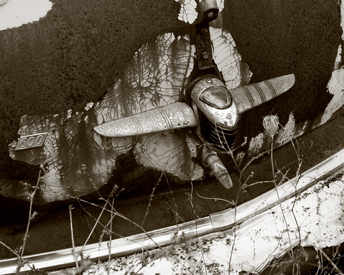
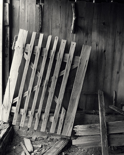
KeymasterShot in black and white or converted after the fact, show us your favourite people, places and things, in grayscale.
Thanks for suggesting this classic theme, U-Man!
September 5, 2009 at 7:36 pm #24310justkat
ParticipantHey U-Man – any tips (c’mon, you’re going to win anyway 😉 ) for those of us for whom B&W doesn’t come naturally?
edited to add: I would think you’d want a pic that naturally has a lot of contrast and (if this isn’t the same thing) you wouldn’t want bokeh. That’s all i got. 😛
September 14, 2009 at 2:52 pm #24311SilverStag
ParticipantGrayscale required, or is tinted monochrome OK?
September 14, 2009 at 11:19 pm #24312thepostess
ParticipantExcellent question.
September 15, 2009 at 2:28 am #24313olavf
ParticipantMy vote would be ‘not’ given we just did selective saturation, and also because it’s more process-oriented than photography oriented.
September 15, 2009 at 12:15 pm #24314linguine
ParticipantTinted monochrome is the same thing as sepia right?
September 15, 2009 at 1:59 pm #24315sleeping
ParticipantTinted monochrome is the same thing as sepia right?
Sepia is one way to tint an image. There are others
September 15, 2009 at 6:31 pm #24316ParticipantMy bad. I was thinking of selectively tinted B&W’s. I’d prefer grayscale only, but I don’t have strong frrlings about it.
September 15, 2009 at 8:56 pm #24317millera9
ParticipantI think that – based on the title of this theme and the entries in the previous version – we should limit this contest to grayscale. I do, however, like the idea of a “color monochrome” contest (be it sepia or teal or whatever you want) because I think it’s very challenging to employ that particular style effectively. SilverStag, if you want to submit that in the themes thread I would support it!
September 15, 2009 at 9:14 pm #24318ParticipantTinted monochrome is the same thing as sepia right?
Sepia is one way to tint an image. There are others
So sepia is monochrome but brownish only?
September 15, 2009 at 10:36 pm #24319ParticipantSo sepia is monochrome but brownish only?
Basically; sepia toning is a process (or maybe a range of processes) that can be done to a Black and White print, and it produces colors in the red-yellow-brown area, but there are also a ton of other toners that can be used for different effects (iron, selenium, copper, gold etc).
It’s pretty common in BW printing, but it is also quite often done quite subtly.
Examples: http://www.moersch-photochemie.de/content/galerie/lang:en
September 16, 2009 at 8:48 pm #24320ParticipantHere’s an example of what I do to most of my bw stuff:
It’s subtle, but I drove the highlights a little yellow and the shadows a little red. Here’s the same process, but going blue in the shadows:
I imagine some folk might not notice it unless put right next to a straight grayscale.
September 16, 2009 at 9:47 pm #24321ParticipantI don’t care too much about which way we go, but I’d lean towards grayscale for this contest and then doing a monochrome contest where people could use whatever colors they felt like.
September 17, 2009 at 2:03 am #24322nobigdeal
ParticipantI tend to agree with linguine. Keep it black & white.
September 18, 2009 at 7:36 pm #24323clouddancer
ParticipantSo what makes a good B&W photo? I’m likely going to convert one of my archive pictures, even if only to play with for now, but I’ve noticed that not everything will work well. So, suggestions?
Edit: I can do B&W mode in my camera so playing with that won’t be a problem, I’m just used to doing color.
-
AuthorPosts
- The topic ‘10-07-09 – Farktography Classic: Black and White 2’ is closed to new replies.