@ennuipoet
Forum Replies Created
-
AuthorPosts
-
ennuipoet
ParticipantI second (or forty second) the basic idea that Farktography is about the content and composition skills first and foremost. I completely advocate the existing rules regarding digital tweaks and techniques. My advocacy of HDR is purely about defending what I considered to be a misunderstood technique by both is practitioners and detractors. A good photograph should stand entirely on it’s content and composition! Enhancements should the icing, not the cake! 😀
ParticipantI’m not familiar enough with what tone mapping is doing under the hood to really know whether it should be allowed under current rules or not,
From Wikipedia: Forms of tone mapping long precede digital photography. The manipulation of film and development process to render high contrast scenes, especially those shot in bright sunlight, on printing paper with a relatively low dynamic range, is effectively a form of tone mapping, although it is not usually called that. Local adjustment of tonality in film processing is primarily done via dodging and burning, and is particularly advocated by and associated with Ansel Adams, as described in his book The Print; see also his Zone System.
The normal process of exposure compensation, brightening shadows and altering contrast applied globally to digital images as part of a professional or serious amateur workflow is also a form of tone mapping.
What does that break down to? Well, if we say “no tonemapping” then we should leave all shots as shot, no tweaking in post. I don’t know about you guys, but I tweak almost EVERY shot in post for saturation and contrast. These adjustments are usually very minimal and are aimed toward what I consider my “artistic style”, I like a vibrant constrasty image.
This image is tonemapped in Photomatix Pro:

to “pop” the reflection in the water. I used it for Reflections 2. It was a single exposure and I did the tonemapping long before the contest so I felt I was within the spirit and the letter of rules. The original shot was little flat because of the time of day it was shot, the enhancements were minimal but really made the shot.
To tell the truth, there is no easy answer to this question. I personally feel that judicious use of software enhancement is exactly the same as judicious use of advanced darkroom techniques. It also purely a personal opinion that many photographers are so anti-software enhancement because anyone can do it without years of training in the darkroom. I know the technique I learned year ago barely brush the edges of dodging, burning, stacking and other methods for accomplishing what I can do in PShop and Photomatix is a matter of minutes. (I feel much the same about the new “in camera” HDR, it takes all the time I’ve spent learning the software and renders it moot.) The idea is to take a good photograph and make it a great photograph. No amount of technical wizardry can take a crappy photograph and make it a good one.
ParticipantSome of my favorite songs are that of Classical Music.
Summon the Heroes, The Olympic Spirit, The 1812 Overture, Farandole.
The only one of these I even REMOTELY have a picture for is the 1812. I have gone to the DC 4th of the July concert for the past three years.
If you fellow farktographers were going to do these songs…any suggestions??
I’ve seen a lot of Win! done with Leggos, and such things. You can always think small rather than big.
ParticipantI’m really looking forward to this, I am going to use shots from my Yashica Mat 124. Mmmmm, tasty Yashinon 80mm goodness!
ParticipantI also cropped it slightly and killed a dust speck or two….
You win for closest to the actual scene (as I recall) the hard part is hitting the particular blue of sky behind the tower. The church is made from a very pale stone, here is a daylight shot from a different photostream:
http://www.flickr.com/photos/broccoli/102940829/
So, it really takes on the hue of the light shining on it, so the red of the tower in the HDR is not terribly exaggerated.
ParticipantHmm. Could I take a shot at that original? Is it RAW or JPG?
It’s in raw, here is a link to the original in Canon Raw
http://www.freeversephotography.com/_MG_8790.CR2
You know, however, if you take it and use software to normalize or equate to the HDR shot, that is going to prove Elsinore‘s point? 😀
ParticipantI’m enjoying the give and take here; I’d like to see more people participate.
FWIW, I think you’re right. The method you use is a digital analog (HA!) of a accepted darkroom process. I would say it is fair to use in Farktography.
In re: the color shift: Cameras are notorious liars to begin with, and a camera as demonstrably imperfect as a digital camera lies even harder. I was trying to recover the remembered color of the dawn hour where the sun was just reaching the mountaintop, and the dark sky beyond provided an extraordinary contrast. The meter in the camera bollixed up the exposure for fair, so it was up to me to try and recreate what I saw and felt.
Of course, I make the same argument about HDR. The best correction of this shot:
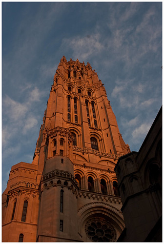
is just to dark, the sky is dropped off and the shadows deeper than they really were, also the color of the stone in the sunrise was shades redder than the captured.
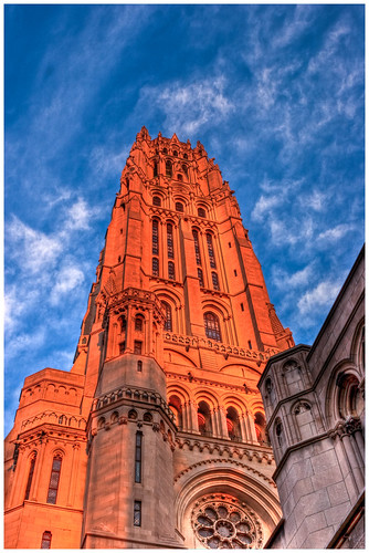
So, using a HDR I am closer to the tonal range of the actual conditions. Looking back at this shot, I should actually cool the temperature of the shot down but with the sun hitting the building just over the horizon, this was as close to the actual scene as I could make it. And I couldn’t do without the software.
ParticipantIt’s definitely a Canon thing, I spend a lot of time in Software trying to compensate for the problem. If it is a shot I care about, I usually do a two layer in Photoshop, adjust each layer to the point I like and then erase and merge. I’m sure there are easier ways, and if anyone has them I’d love to hear it. I’m actually glad to know that is is not just my camera.
I’m not sure whether that kind of treatment would be in keeping with Farktography rules, though. I guess you could argue that it’s a color correction?
I don’t do it Farktography posts, that amount of post-processing while technically color correct is to much for honesty. I use the two layer method for shots that I want to improve. This shot hasn’t had the alteration, but really should
http://www.flickr.com/photos/ennuipoet/5143595853/in/photostream
The only color correction I do in Farktography is vibrance and saturation in Lightroom.
ParticipantI like pretty much all of these. 🙂
Hey. This theme made me remember a question I have. My Canons seem to have trouble with largish, relatively uniform red-red things. They get blown out in relation to the rest of the frame.
Example – http://photos.imageevent.com/ulle17/peopleplaces/m_7822.jpg
Check out the red dress. It featureless in this pic but not in real life. Any input? (I spent an afternoon taking pics of this dynamic lady for a mail-out thing she did while running for county board.)
It’s definitely a Canon thing, I spend a lot of time in Software trying to compensate for the problem. If it is a shot I care about, I usually do a two layer in Photoshop, adjust each layer to the point I like and then erase and merge. I’m sure there are easier ways, and if anyone has them I’d love to hear it. I’m actually glad to know that is is not just my camera.
ParticipantOne day I’ll actually build a website for photos, and I’ll use more space, but if all you need is a place to host pics, it’s certainly economical. There is a free application called ‘Coppermine Photo Gallery’, but I haven’t checked it out.
I didn’t know godaddy was unlimited bandwith…I am totally wasting that! Coppermine is a craplication, I tried using it when I first set up my website, it is complicated, limited and balky. I use Lightroom’s flash apps to make galleries…though right now I don’t really have much up, my website is kind of a placeholder though my pblog is updated daily.
ParticipantHow much is the Godaddy option? because the pro Flickr is only 25 bucks a year for completely unlimited photo storage and upload. and I agree with every thing Kestrana said about it.
I use Godaddy to host my website at 6 bucks a month and the bandwidth is not unlimited…Flickr is the best way to go money wise.
ParticipantI don’t have a problem dropping it. I got nothing for it anyway
/see what I did there!I see what you did there!
I’m fine with dropping it FWIW.
ParticipantSeriously, though, I was a little surprised to see the theme called “Autumn” because I thought “Fall” was more widely used. Surprised, yet at the same time delighted. Our next step is to export a few more letter u’s over there.
Keep your unwanted “U”s out of our endeavours!
DAMNIT! 😀
Participantennui I echo the masses. Get any shots of them as a family?
I spoke with them for about two minutes, gave them my email address to get a copy of the shot and never heard from them again. The marched off in the parade and that was that.
ParticipantOMG Kestrana, those colors in your flower shot are gorgeous! I’ve never seen one like it, do you know what kind of flower that is?
Unfortunately no. I’ve looked on the Central Park flower website and several tropical websites. Found some other pictures of the same flower on Flickr with such helpful names as “Blue Flower”.
Damn, you know that right under the flower there was a little plaque telling people what kind of flower it is? I mention that because I NEVER actually look at the thing and late I am always wondering what kind of flower it is.
It is a beautiful shot though! Getting that kind of detail without a tripod gets you a votive offering to the Steady Arm Goddess! 🙂
-
AuthorPosts